Add profile page #165
No Assignees
Notifications
Due Date
No due date set.
Dependencies
No dependencies set.
Reference: coracle/flotilla#165
Reference in New Issue
Block a user
Delete Branch "%!s()"
Deleting a branch is permanent. Although the deleted branch may continue to exist for a short time before it actually gets removed, it CANNOT be undone in most cases. Continue?
While exploring the app, I noticed that the user profile preview modal shows almost the same information as the search result cards.
Because of this, the interaction feels a bit redundant — tapping on a user doesn’t really reveal anything new or more detailed.
From a UX perspective, this breaks the usual expectation where a card gives a quick summary and the modal expands on it with deeper information and useful actions.
A few things I observed:
– Both the search card and modal display very similar content (bio, metadata, layout)
– There isn’t a clear distinction between what’s meant to be a summary (card) and what’s meant to be a detailed view (modal)
– The modal doesn’t add much extra depth or meaningful actions beyond what’s already visible
This can make browsing less efficient, since users don’t gain much value from opening profile previews.
Suggestion:
It might help to create a clearer separation between summary and detailed views:
– Keep search cards concise and easy to scan
– Use the modal to show richer information and more meaningful actions (e.g., follow, message, view full profile)
I’d be happy to explore a design direction for this.
The profile dialog is just a stub for now, the plan has always add a profile detail page. Let me hijack this issue to that end — feel free to work on it. A few action items:
Got it, that makes sense — thanks for the clarification.
I’ll explore a design direction for a full profile page, while keeping the modal as a lightweight preview, and share an iteration soon.
Redundant user information between search cards and profile preview modalto Add profile pageHi @hodlbod!
I worked on adding a dedicated profile detail page and reducing redundancy between search results and the profile preview modal in Flotilla.
Context:
The current experience shows similar information across search cards and the preview modal, without a clear progression to a more detailed user view.
Approach:
– Introduced a structured flow: search → preview → full profile
– Kept the modal lightweight for quick access
– Designed a profile detail page to provide deeper user context
Key Improvements:
– Reduced duplication between search cards and the modal
– Added a dedicated profile page with tabs for activity (microblogging notes) and spaces
– Improved information hierarchy and overall navigation
Figma (Design):
https://www.figma.com/design/k1d1xqUPBtAE9wlxdd7aj6/Flotilla--Add-profile?node-id=0-1&t=HRqmQuVpMPpXQnrO-1
Prototype:
https://www.figma.com/proto/k1d1xqUPBtAE9wlxdd7aj6/Flotilla--Add-profile?node-id=1-2119&t=HRqmQuVpMPpXQnrO-0&scaling=min-zoom&content-scaling=fixed&page-id=1%3A546
Would love your feedback — happy to iterate further!
Also, I had a quick clarification regarding “recent microblogging notes” — what kind of output are you expecting here (e.g., a feed of kind 1 notes or a more condensed view)?
I’ll incorporate this into the profile page and share an updated iteration once I have clarity.
Thanks! I like the idea of the horizontal layout for the profile page. A couple things:
See the current profile page in Coracle for reference.
Hi @hodlbod !
Thanks for the feedback — I’ve updated the design based on your suggestions and refined the overall flow.
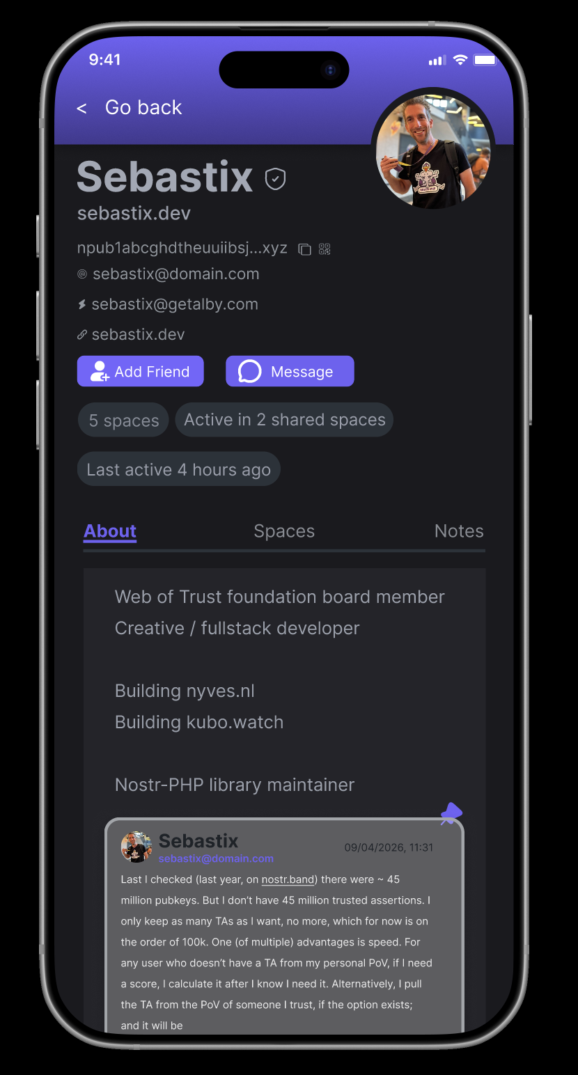
Implemented all updates including mobile layout with tabs below the bio, pinned notes in About, profile metadata (NIP-05, zap, website), npub copy + QR flow, and an infinite-scroll activity feed. Also improved the search → preview → full profile hierarchy to reduce redundancy and make the progression clearer.
Figma (Design)
Desktop Prototype
Mobile Prototype
Would love your feedback — happy to iterate further if needed!
Also had a quick idea — what do you think about adding a lightweight “trust context” (like mutuals or shared spaces) to help users better evaluate profiles?
For example, something like:
“Active in 2 shared spaces”
Would this be useful, or out of scope for now?
Yes, absolutely. Context based on shared spaces and web of trust (people you follow who follow this person) would be great. Also show the wot indicator somewhere too (the little colored circle)
Got it, I’ll focus on shared spaces and include a subtle WoT signal indicator as well. Will share an iteration soon.
Also, would appreciate your feedback on the previous iteration whenever you get a chance.
It looks good!
@sarthak_788 are you still working on this or should I allow someone else to pick it up?
I’m currently working on it and will share the next iteration soon. Please keep it assigned to me.
Hi @hodlbod ! I’ve updated the designs with the trust context additions as well — including shared spaces signals and a subtle WoT indicator across desktop + mobile.
The latest changes have been added to the same Figma links above. Please let me know if any further changes or additions would be helpful!
A few things:
I’ve made another round of refinements based on your feedback — moved npub below the name, removed extra surfaced metadata, kept the WoT indicator consistent with the current style, refined the overall hierarchy/context signals, and updated the pinned note styling to feel more native across both desktop + mobile views.
Much better, thanks. We can leave off the shadows (to fit the current design), but this is good enough to move to dev.
Thanks! I’ll remove the shadows for consistency and clean up the files for handoff. Glad the direction works.