Improve the sign-up experience with better guidance and validation #217
No Assignees
Notifications
Due Date
No due date set.
Dependencies
No dependencies set.
Reference: coracle/flotilla#217
Reference in New Issue
Block a user
Delete Branch "%!s()"
Deleting a branch is permanent. Although the deleted branch may continue to exist for a short time before it actually gets removed, it CANNOT be undone in most cases. Continue?
Description
I went through the sign-up flow a few times (both email and key-based) and ran some informal usability tests with people who aren't familiar with nostr. A few things kept tripping people up.
1. No sense of where you are in the process
The sign-up has 3-4 screens depending on the path but there's no progress indicator. Few people asked "how much more is there?" especially during the email flow where you're waiting for a confirmation code. A simple step counter or progress bar would help a lot here.
2. Password requirement is a surprise
The 12-character minimum only shows up as a toast after you hit Continue. I think it should be visible next to the field from the start.
3. Email field missing
type = emailEmail field missing type="email". Browser won't catch typos like a missing @ or extra spaces before submitting.
4. Login errors are vague
"Sorry, we were unable to log you in". That could be wrong password, wrong email, or a network issue. Users can't tell what to fix.
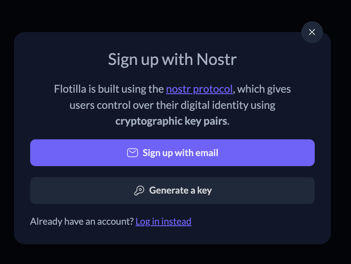
5. Nostr concepts can be overwhelming for new users
The first screen itself mentions "cryptographic key pairs" right away. For people coming from Discord or Slack, that's a wall.
Who this affects
Casual users arriving through invite links who are the content creator and bitcoin project communities Flotilla is targeting. If sign-up feels confusing, they leave.
Suggested improvements
Happy to wireframe these and work on a PR if interested @hodlbod
Thanks, I've added issues for 1-4, for item number 5 would you be willing to mock up a change in this issue?
Yes I am already working on this @hodlbod 👍
Hi @hodlbod, Swapped the heading to "Join Flotilla" and added a separate "What are key pairs?" screen for when that concept actually comes up. Does this feel right?
I think that subtitle should probably not mention keypairs or the protocol at all
Does this copy make sense @hodlbod ? Does not mention keypairs or protocol while also preserving the meaning.
Let's go with "Censorship resistant digital spaces for communities."
Thanks that does reflect flotilla better. Going with that line, here's what I'd propose for the modal copy:
Keeps the tagline as the hero and reframes the subline around the sign-up action. Happy to open a PR with this change if you're good with the wording.
Yep, looks good