Redesign threads #243
No Assignees
Notifications
Due Date
No due date set.
Dependencies
No dependencies set.
Reference: coracle/flotilla#243
Reference in New Issue
Block a user
Delete Branch "%!s()"
Deleting a branch is permanent. Although the deleted branch may continue to exist for a short time before it actually gets removed, it CANNOT be undone in most cases. Continue?
Threads are intended to be linear, non-nested reply structures, something similar to old-school forums. The current view collapses old comments, and is sort of hard to read.
Hi @hodlbod , I would like to work on this if it's alright?
Gave this a go, Right now the root post and every reply use the same box card with a shadow, so the page looks like a stack of identical boxes and it's hard to tell which post is the topic vs. a response. A few changes that should help:
1. Make the root post look different from replies. A purple accent stripe on the left, an "OP" tag, and a larger title so you can spot the topic right away.
2. Drop the card/shadow on replies, just using a thin line between each reply, and a small 1, 2 ... number next to each one makes it easier to scan and link a specific reply.
3. Added a reply button to each reply as well so conversation can point back to specific message.
4. Keep the thread title, reply count and room always visible at the top when you scroll so not to lose context
@hodlbod Let me know if you like this direction.
This looks good, but I think it's a little too close to a reddit metaphor. Here are some elements that might help:
Thanks for the feedback! I took another shot at it. OP is now just post #1, only marked by a small OP badge and the room pill. Each post has a meta strip with timestamp + (#Number ↗ permalink) for the phpbb row header feel. Can drop the number next to the reply if feels duplicated. Also swapped the per-post action button to the emoji/... trio before like on chat messages.
Pagination is shown as two states stacked: Page 1 of 1 (truthful to a 5-post thread) and Page 3 of 7 (mocked, to show the rest).
@hodlbod Let me know your thoughts.
Much better, thanks! I do feel that the post numbers on the left are redundant, maybe we could go further and imitate phpbb by putting the profile information in that area? Only on desktop of course, mobile should probably remain stacked.
Oh yes great idea! The post numbers are gone now and that space holds the profile info: avatar, name, handle, post count in this space, and join date. OP badge sits in there too for post #1.
I think this works well because each post becomes a self-contained unit you can scan top-to-bottom: who it is, when it was posted, what they said. You don't have to jump back to a sidebar to figure out who's talking and the page reads more like a conversation between people instead of a list of comments.
Thoughts? @hodlbod
Yeah, I think this is great. Just some very small nitpicks now:
Great, makes sense! Made the mockup with the refinements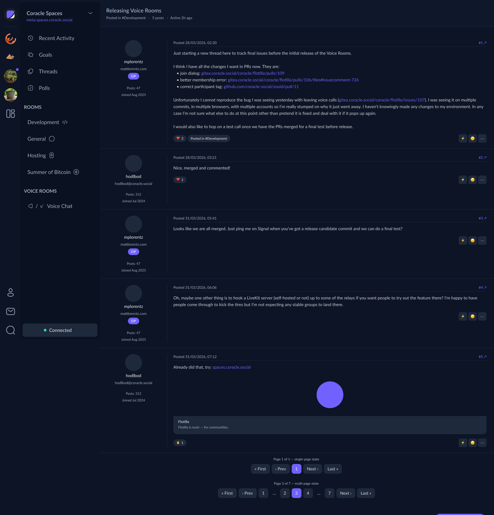
Also pulling in the mobile sample, just one post collapsed to the stacked layout to show how it falls back at phone width.
Another nice reference:
https://www.figma.com/design/A1bicqAMjlE4F4OC3ViR3G/Squalk?node-id=0-1&p=f&t=P18KGg61lX6OSY3T-0