feat:(#145) add start chat FAB #152
No Assignees
Notifications
Due Date
No due date set.
Dependencies
No dependencies set.
Reference: coracle/flotilla#152
Reference in New Issue
Block a user
Delete Branch "Prat_09/flotilla:145-startChat-FAB"
Deleting a branch is permanent. Although the deleted branch may continue to exist for a short time before it actually gets removed, it CANNOT be undone in most cases. Continue?
Improves accessibility of the "Start Chat" action by introducing a Floating Action Button (FAB), making it more accessible and aligned with common messaging UI patterns.
Changes:
Implementation:
Checks:
pnpm run format - pass
pnpm run lint - pass
pnpm run check - 0 errors and 0 warnings
Fixes #145
Thanks for the PR! A couple comments, and one other thing — we should make sure the FAB is aligned on mobile with the user's avatar.
@@ -0,0 +42,4 @@style="width: {plusSize}px; height: {plusSize}px;"><line x1="12" y1="5" x2="12" y2="19" /><line x1="5" y1="12" x2="19" y2="12" /></svg>The SVGs shouldn't be hard-coded in here. Instead, include a
childrensnippet in props and use theIconcomponent with one of the icons already included in the project.@@ -29,1 +31,4 @@const startChat = () => pushModal(ChatStart)let term = $state("")let isClient = $state(false)We don't do SSR, so there's no need to add this check
@@ -63,0 +69,4 @@{#if isClient}<div class="absolute bottom-10 right-4 hidden md:block"><FAB onclick={startChat} size={44} className="!static !m-0" /></div>We shouldn't need a wrapper and important overrides. I think it would make sense to show the FAB on the bottom right of the screen on desktop, rather than in the secondary nav.
Thanks for the feedback @hodlbod ! I’ll refactor the FAB to use the Icon component and clean up the SSR-related logic.
Regarding FAB placement, I noticed that having it fixed at the bottom-right works well generally, but in desktop during an active conversation it can overlap message content or interfere with interactions near the input area.
Would it make sense to:
This keeps the action easily accessible while adapting to the context. Happy to implement this if it aligns with your vision.
@@ -16,0 +19,4 @@onMount(() => {isClient = true})No need to include this
That's a very good point, I think maybe the correct solution would be to add a full-width button to the bottom of the side nav rather than a FAB similar to the connection status button on the rooms menu. How does that sound?
@hodlbod
That makes sense - especially from a consistency and non-intrusive UX perspective, and aligning with the existing side nav patterns like the connection status button.
I explored both approaches (FAB and full-width CTA) and created the prototypes for each approach in both desktop & mobile version, and while the full-width CTA feels more stable within the current layout, the FAB felt more subtle and visually lightweight, without adding extra density to the side nav.
Mobile - https://www.figma.com/proto/SO2fPukHeKC120ZqZQ9kSh/Flotilla-SOB26?node-id=0-1&t=IkaFDeThh7zAbAUX-1
Desktop - https://www.figma.com/proto/SO2fPukHeKC120ZqZQ9kSh/Flotilla-SOB26?node-id=103-2068&t=IkaFDeThh7zAbAUX-1
Just sharing a small suggestion: the full-width CTA doesn’t seem like the best fit for mobile and desktop. A standard floating CTA at the bottom-right as already implemented feels cleaner.
For desktop, we could also consider placing the button in the sidebar, check the empty white box in the attached image
I don't think putting it in the primary nav would make sense from an IA perspective; users just wouldn't look there.
What about this: instead of the three-dots overflow menu, show that button as well as a "plus chat" button next to each other similar to how we show both the search and info icons at the top of a room?
@hodlbod
I’ve shared a detailed comparison in this comment: #152 (comment) including prototypes for both the FAB and full-width CTA approaches.
From a UX perspective, I feel the FAB works well for the “Start Chat” action since it represents a primary action on the chat screen. It’s easy to discover without requiring users to explore the interface, and it keeps the layout visually clean and less cluttered.
Makes sense, users typically wouldn't look for the add chat button there.
Seems better, as it will keep the design language consistence, and will help users get used to the pattern.
The FAB works well for the mobile layout, but from a desktop perspective it feels a bit redundant (see attached image). Also, in the active conversation state, that button looks a bit confusing.
@userAdityaa
That’s a fair point - I agree that the FAB can feel slightly redundant on desktop when the user is not in an active conversation.
However, one scenario where it adds value is when a user is already inside a conversation and wants to quickly initiate another chat. In that context, having a clear and readily accessible action helps avoid additional navigation or friction.
I don't know how frequently this would be the case, and anyway on desktop that would be possible anyway with the full width action button in the sidebar, or the small button in the sidebar header. I'd still like to see what that might look like. Maybe something like I've attached.
Makes sense, I have attached two versions of full-width Start Chat action buttons for desktop interface.
Also, wanted to know - are we thinking of keeping FAB on mobile interfaces while full-width CTA on desktop?
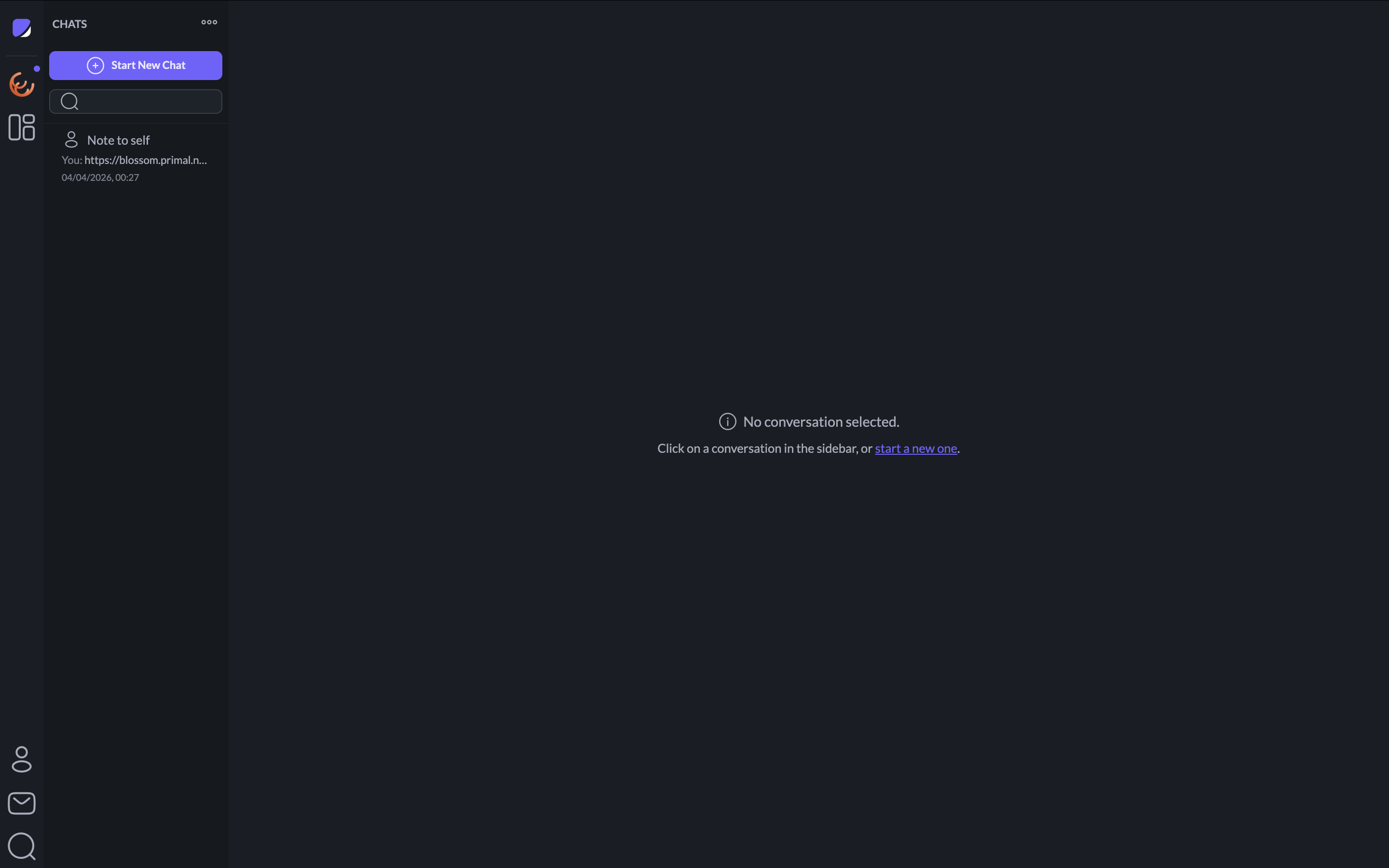
Thanks, I think the Top CTA looks pretty good. And yes — let's do a FAB on mobile and a full-width CTA on desktop.
Sure, on it.
@hodlbod
Changes:
Implementation:
Checks:
Mobile interface with FAB:

Desktop interface with full-width CTA:
9c368b94bdto9cbdc5415a